Launch Screens and the SwiftUI App Life Cycle on iOS 14

I have decided to rewrite Bouncer from scratch using the latest SwiftUI version available in iOS 14. This includes using the new SwiftUI App Lifecycle, which allows you to skip UIKit entirely, alongside the AppDelegate and Storyboards.
As I got closer to finishing the app, I decided to replace the default (white) Splash Screen with something better, but since there was no Storyboard anymore, I had no idea how. After a little digging, I could not find much in the documentation, but after watching the “What’s new on SwiftUI” video from WWDC20 and digging a little into Plist options, found that Apple has provided a new Key in the info.plist to help you create a basic LaunchScreen: The “Launch Screen” (UILaunchScreen)
The Setting:

By default is empty, but autocomplete helps you figure out what you can do with it. Unfortunately it does not allow much customization and you cannot create your custom design using SwiftUI, which I was expecting, but there’s enough to get by.
Here’s a quick overview of the available options
Background Color
You can use any named color from your Asset Catalog, which allows you to define colors for Both Light and Dark mode. Just set the value to the color name in your Asset Catalog. No quotes or anything extra is needed.
Image Name
This option allows you to add an image from your asset catalog. It will be centered on the screen by default, and you can use scaled (@2x, @3x) versions. The image is displayed on top of the specified background color, and it can include an alpha channel (PNG) for transparency. (See example below)
Image respects safe area insets
In case the image exceeds the device screen size, setting this to NO will allow it to go over safe areas (top and bottom) and cover the entire screen. “NO” is the default behavior.
Show Navigation/Tab Bar/Toolbar options
As you may know, Apple’s recommendation for Launch Screens is to mimic the initial state of your app with an empty view, so the app seems fast and responsive on launch.
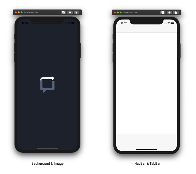
These options will allow you to display a mocked, navigation bar, tab bar, or toolbar on the Launch Screen. When enabling them, you will have the option to provide an image from your asset catalog, but if you leave it blank, a default UI empty navigation bar, tab bar, or toolbar is used instead. (See example below)
Here’s an example:

On the left, I’m using background color and a transparent version of the Bouncer logo. Note that the image is not resized or scaled, so you will need to provide the correct dimensions. In this case, I added @1x, @2x, and @3x versions, being the smallest 200x200px.
On the right, I left the background color empty, and just added the default NavigationBar and TabBar options.
That’s it!. Pretty straightforward huh?. Feel free to follow me and reach out on Twitter if you have any questions or feedback.
